A Few Tweaks, For An Amazing Experience
by Horacio Ochoa, on Jul 12, 2016 11:31:59 PM

We know it feels like Summer only just started... but, here at Bloomz, we are getting ready for the new school year. And we took a big step to an amazing year this week with a few improvements to our app navigation!
Last school year we spent plenty of time listening to our users and planning for an improved app that would make it easier for you to find the things that matter the most. Our team spent hours talking to teachers and parents, and the result of all that work is here. You'll notice the changes as soon as you launch your app, and it should be easy to find everything from the get-go. Here is a quick rundown on everything that is new:
1. New Navigation Menu
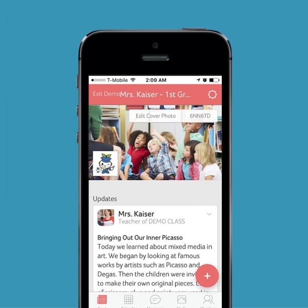
The first thing you'll notice when you open Bloomz is that the menu at the bottom of your screen is a bit different. It now includes an item called Media, where you'll find all photos, albums, documents and (starting September) videos. More on this in below.
This navigation is now consistent across all your home feed, and your classroom or group feed, so the "More" section previously available at the group level is now gone and in its place you see the "Members" tab.
You'll also notice that the button "+" to create new items has been moved from the small top right, to a more prominent place above and right to the navigation menu. This is persistent in all tabs and inside all groups. Clicking on it, will display all items available on the current screen.
At the classroom/group level, you can see a small cog at the top right of the screen indicating the group settings (previously found on the "More" tab).
2. Calendar and Volunteers
The Calendar tab continues to work as before and now brings together events AND volunteer requests, everything in one feed. However, if you want to access the volunteer requests only, you can do so by accessing the "Volunteer Asks" at the top left of the screen.
3. Media tab
As explained above, we created a new tab called "Media" that incorporates all photos, albums, (soon) videos and documents (e.g. all documents you've shared with your classroom).
At the classroom/group level, the documents section also incorporates what was previously stored in the "Info" section, i.e. all the information for the classroom, and you can add info sections in this tab, the same way you could in the previous version.
4. Messages
In your home navigation, your messages tab hasn't changed, it still gives you access to all the conversations you've had on Bloomz. Now, as you navigate to your class or groups, you will find the "Messages" tab too. At this level, the "Messages" tab will show you only the conversations that you've had with said class or group - i.e. this is a group chat and all the members of the class/group will see what you post.
5. Desktop
All changes are consistent across phone and desktop. However, there are a couple of differences in the way the menus are presented...
First, you'll notice that the navigation options (Home, Calendar, Media and Contacts) have moved from the left tray, to the top of the screen, making navigation between your home screen and groups much more seamless.
Lastly, you'll notice that links to your profile and "Support" have now moved from the top of the left tray, to the bottom of it.
We hope all these changes make it much easier for you to navigate Bloomz and find the information you are looking for faster and easier. We welcome your feedback, so please feel free to tell us what you think in the comments section below.


